MY LOGO PROCESS
From concept to creation
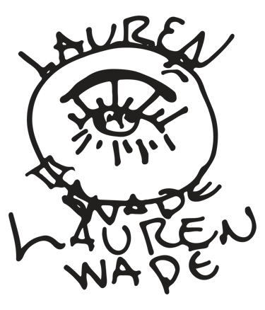
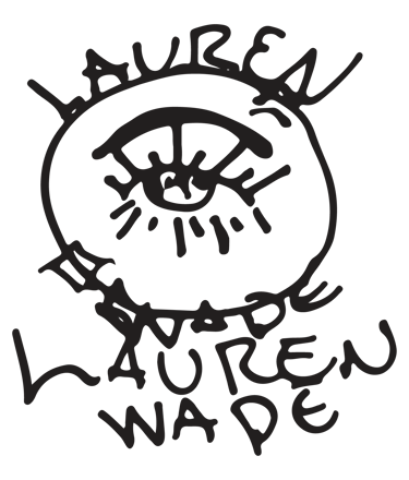
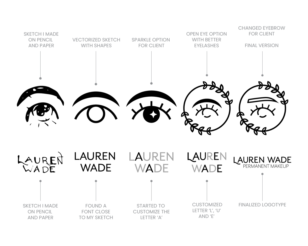
This logo was designed for a client in the PMU industry who wanted something sleek, feminine, and minimal. She specifically wanted to avoid the common detailed eye and eyebrow illustrations used across the industry, and gave me room to explore.
I started by reviewing common PMU branding trends, then moved into a full sketching phase using a wide-range concept approach. After exploring and refining ideas over time, the direction landed on a simple eye shape paired with a universal eyebrow form. The eyebrow was later adjusted to better match the client’s vision.
The final logo is clean, modern, and distinct within the PMU space while still feeling approachable and professional.

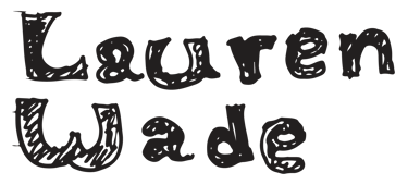
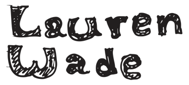
SKETCHING PHASE


TIMELINE
LOGO VARIATIONS
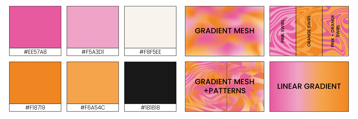
COLORS & PATTERNS
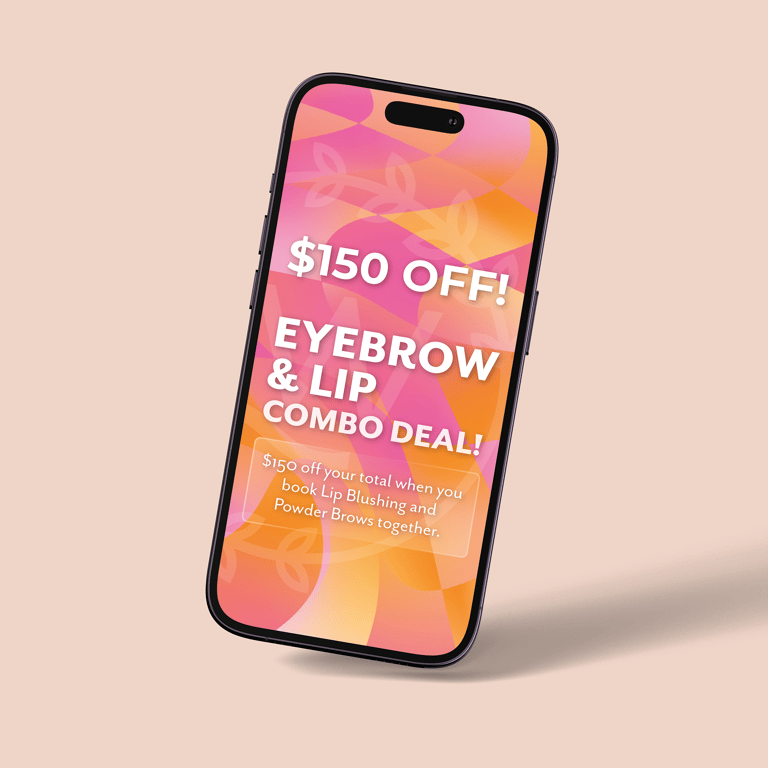
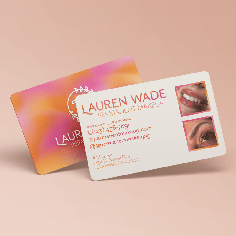
BRANDING IN ACTION